-
디스플레이(display)HTML&CSS/CSS 2023. 1. 4. 08:43
display 종류
inline
block
inline-block
flex
list-item
none
inline display
inline 요소들은 다른 요소들과 같은 줄에 머무르려고 하는 성향과, 필요한 만큼의 가로 길이만 차지하는 성향
- <span>
- <a>
- <b>
- <i>
- <img>
- <button>
예시
<!DOCTYPE html>
<html lang="en">
<head>
    <meta charset="UTF-8">
    <meta http-equiv="X-UA-Compatible" content="IE=edge">
    <meta name="viewport" content="width=device-width, initial-scale=1.0">
    <title>Document</title>
    <style>
        i {
            background-color: green;
        }
    </style>

</head>
<body>
    My <i>name</i> is Yuna!
</body>
</html>
block display
- <div>
- <h1>, <h2>, <h3>, <h4>, <h5>, <h6>
- <p>
- <nav>
- <ul>
- <li>
div태그 예시
<!DOCTYPE html>
<html lang="en">
<head>
    <meta charset="UTF-8">
    <meta http-equiv="X-UA-Compatible" content="IE=edge">
    <meta name="viewport" content="width=device-width, initial-scale=1.0">
    <title>Document</title>
    <style>
        div {
            background-color: green;
        }
    </style>

</head>
<body>
    My <div>name</div> is Yuna!
</body>
</html>
==============================================
display 바꾸기
모든 요소는 기본적으로 정해진 display 값이 있는데요. CSS를 통해서 이를 바꿀 수 있습니다!
1) inline 요소를 block으로 바꾸기
<!DOCTYPE html>
<html lang="en">
<head>
    <meta charset="UTF-8">
    <meta http-equiv="X-UA-Compatible" content="IE=edge">
    <meta name="viewport" content="width=device-width, initial-scale=1.0">
    <title>Document</title>
    <style>
        i {
            display:block;
            background-color: green;
        }
    </style>
</head>
<body>
    My <i>name</i> is Yuna!
</body>
</html>
2) block 요소를 inline으로 바꾸기
<!DOCTYPE html>
<html lang="en">
<head>
    <meta charset="UTF-8">
    <meta http-equiv="X-UA-Compatible" content="IE=edge">
    <meta name="viewport" content="width=device-width, initial-scale=1.0">
    <title>Document</title>
    <style>
        div {
            display:inline;
            background-color: green;
        }
    </style>

</head>
<body>
    My <div>name</div> is Yuna!
</body>
</html>
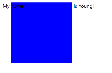
inline-block
inline요소처럼 다른 요소들과 같은 줄에 머무르면서 block요소처럼 가로, 로 길이도 설정해 주고 싶을 때 사용
<!DOCTYPE html>
<html lang="en">
<head>
    <meta charset="UTF-8">
    <meta http-equiv="X-UA-Compatible" content="IE=edge">
    <meta name="viewport" content="width=<!-- device-width -->, initial-scale=1.0">
    <title>Document</title>
    <style>
        i {
            display: inline-block;
            width: 200px;
            height: 200px;
            background-color: blue;
        }
    </style>
</head>
<body>
    My <i>name</i> is Young!
</body>
</html>
d
정렬해보기
# 가로 가운데 정렬
- inline, block요소별로 다르다
inline요소
>> inline 또는 inline-block 요소면 부모 태그에 text-align: center;를 써주면 된당
<!DOCTYPE html>
<html lang="en">
<head>
<meta charset="UTF-8">
<meta http-equiv="X-UA-Compatible" content="IE=edge">
<meta name="viewport" content="width=device-width, initial-scale=1.0">
<title>Document</title>
<style>
.container{
text-align: center;
background-color: blue;
}
</style>
</head>
<body>
<div class="container">
로고임당<img src="./images/instagram.png" height="50">
</div>
<!-- 이미지는 inline요소이다 -->
</body>
</html>
block요소
>> block 요소면 margin-left: auto;, margin-right: auto;를 써주면 된당
예시 대표적인 block요소인 div 태그
<!DOCTYPE html>
<html lang="en">
<head>
<meta charset="UTF-8">
<meta http-equiv="X-UA-Compatible" content="IE=edge">
<meta name="viewport" content="width=device-width, initial-scale=1.0">
<title>Document</title>
<style>
.block-element{
width: 100px;
height: 50px;
margin-left:auto;
margin-right:auto;
background-color: lime;
}
</style>
</head>
<body>
<div class="block-element"></div>
</body>
</html>
=======================================
# 세로 가운데 정렬
실습하기'HTML&CSS > CSS' 카테고리의 다른 글
스타일시트 (0) 2023.01.20 포지션(Position) (0) 2023.01.04 선택자정리 (0) 2023.01.03 마진(Margin) vs 패딩(Padding) (0) 2023.01.03 둥근모서리/배경색/배경이미지/그림자 (0) 2023.01.02